 I had to rent a car last week for a family trip through the frozen wastelands of Southern Ontario, which meant an even more arduous journey: through the web sites of car rental agencies.
I'm going to single out one in particular - National - but every other site I looked at had its own flavour of misery to inflict on hapless users. (I feel honour-bound to mention that the actual staff were very nice to us and the pickup and dropoff at Pearson were a breeze.)
After I went through the process of giving National the dates and times I wanted to collect and dispose of the car, and then comparing the rates for various sizes and classes of vehicle, I was ready to click the OK button.
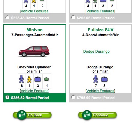
Here's the screen I saw:

Twice - twice! - I clicked on the tasty-looking left-hand button that says "go!" in bold, high-contrast letters.
And each time, I had to start again.
Because that button actually isn't for going. It's for stopping and backing up. And if you're paying close attention, you'll notice the words "Go Back" in light text next to it.
Part of the fault was mine - it was late in the day and my mind was on cruise control - but a lot of your users are likely to be in the same state. When they see a big, glossy button that says "go!", years of web surfing have taught them that clicking it will submit the form. And years of driving have taught them that green means moving forward.
So why in hell would National use a big green button to mean "back up"?
The answer, it seems, is National's slogan: "Green means go!" Someone at the company made the decision to extend that branding to their web site's interface elements... including the buttons.
It's a good thing that whoever made that call isn't in charge of vehicle specifications, or the cars' dashboards would consist of nothing but big glowing green "Go!" buttons with the words "Engine is on fire. Please pull over" in tiny type beneath them.
Look, by the time your users are filling out the online rental form, they're committed to the transaction. You don't need to brand the experience to death. You do need to make the process as swift and painless as possible, so your user stays committed through to completion... and feels motivated to come back to the site next time they need a car.
Otherwise, green will mean go.
As in, elsewhere.

 It's an axiom of Web 2.0 that you have to, have to allow users to comment on your content. Have to.

 I had to rent a car last week for a family trip through the frozen wastelands of Southern Ontario, which meant an even more arduous journey: through the web sites of car rental agencies.
